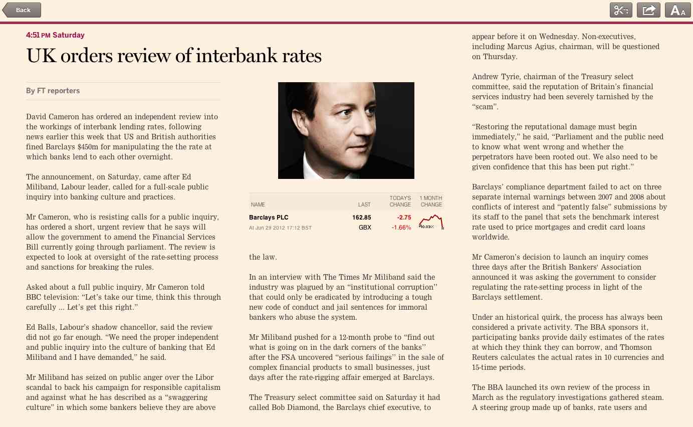
With the advent of CSS3, it’s finally possible to lay out content in horizontally paged columns, but in a way that barely scratches the surface of the creative layouts that print publishers have been using since the 19th century! It’s time for the web to catch up.
Newspapers like columns. In fact, we’ve been printing text on very large pages in a dozen or more narrow columns for more than a century. But online, most media companies display articles in a single scrollable column. However, with the popularity of hand held tablets in the last couple of years, we are rediscovering column layouts for our content.
Effectively, tablets are as much of a new form factor as the computer screen was when we first went digital. And in terms of a reading experience they sit somewhere in between holding a physical newspaper and reading from a computer monitor. The most respected tablet reading apps tend to gravitate more to the classic print style, and with good reason. That style of presentation has an elegance and readability that has had 150 years to develop. The more interesting question is why do we do something different for the desktop and laptop user.
There are two factors that come into play. One is the ubiquity of the vertical scrolling pattern: we have no choice but to present content in one single vertically scrolling column because that’s how web pages were originally conceived to work, and the input devices used to control the computer assume that the user will need to scroll vertically a lot. Scroll wheels on mice, for example, rarely make scrolling horizontally as easy as scrolling vertically. People have certainly tried escaping from the one-long-column pattern, but in the desktop use case it’s totally pointless, like selling a tin of beans that you’re supposed to open with a laser. People don’t have lasers, they have tin openers, and you’re not being innovative, you’re being annoying.
Making up the second factor are the technical limitations of column layouts in today’s web. Even with the latest CSS3 standard, and even using a pre-release browser build that incoporates features literally just coded, we STILL can’t elegantly do things with layout that we did in print in 1900. When it takes a day to build a web page with a single column article, and three weeks to create a multi-column one, it’s just not worth the effort.
Touchscreen devices have removed the first of these issues completely. Whilst newspapers were late to the digital party, they’ve got in early in the touchscreen era, and started experimenting with new interation styles before anything has become the defacto standard. People are equally happy swiping in any direction – BlackBerry’s devices even attach special functions to diagonal swipes – and the posture of the user in relation to a tablet is totally different to a desktop or laptop device.
At the same time, we shouldn’t rush to create print-style layouts on touchscreens just because we’re scared of the internet and want to take refuge in something familiar which has worked before. Eventually, as it did with desktop computers, a defacto standard may emerge. But right now, the field is open to experimentation, and we can try out various ways of interacting with content without annoying people by appearing to be pointlessly swimming against the tide.
Which brings us to technology. The second factor limiting our ability to use multi-column layouts on the web. At the FT we beleive in using web technologies as the primary way of distributing our content digitally, so when we put it on tablets, we wanted column layouts. In response to that need we created a JavaScript library that can replicate the complexity of print layouts, which we call Columnflow.
Columnflow provides a rich feature set in a small code footprint with no dependencies:
- Configurable column widths, gutters and margins
- Fixed position elements
- Elements spanning columns
- Keep-with-next class to avoid headings at the bottom of a column
- No-wrap class to avoid breaking marked elements across columns
- Grouping of columns into pages
- Standardised line height to align text baseline to a grid
- Rapid reflow on font size change
It works by rapidly identifying the ‘border’ element, that is, the element at the bottom of column 1 which has been clipped by the boundary of the container. The border element is then duplicated, and copied to the top of column 2, where it’s given a negative margin equal to the amount of the element that is visible in column 1. We perform the same calculation at every multiple of the column height, to find the boundary elements and break points for subsequent columns. After the calculations are complete, all the markup is shifted into column DIVs in one single DOM operation, which optimises the performance of the layout.
We use Columnflow extensively in the FT web app, and other applications produced by the labs team. We’d be delighted if others can benefit from it and help us to enhance it, so today we’re releasing it as an open source project. You can find the code, along with plenty of examples and full documentation on our Github account.